
The Georgia Department of Natural Resources’ (DNR) logo is its signature and is the central element of its brand identity. Every marketing and communication piece should respect the good name of the brand and enhance the brand in every possible way through consistent use of logos, colors, fonts and other brand-specific directives. Consistency defines presence.
- Who to Contact
- Logos
- Color Palette
- Typography
- Photography
- PowerPoints
- Business Cards
- Letterheads & Fax Cover Sheets
- Email Signatures
DNR Sub Brands
Click your division below to see specific branding guidelines for your division.
Commissioner's Office | State Parks & Historic Sites | Wildlife Resources | Coastal Resources | Law Enforcement | Environmental Protection
Who to Contact
If you have questions, need guidance, or would like something created for your communications project, please see the chart below on who to contact.
Logos
Because of their value, any mark that is intended to represent DNR is the property of DNR and must fit all guidelines below. The wordmark may be used non-commercially by DNR staff as long as used appropriately within the guidelines set forth in this manual.
Wordmark

- While the preferred logo should be used whenever possible, there is also a black version (and white) available to accommodate special graphic situations.
- When this logo is used, the standard position, proportion (aspect ratio) and relative size relationship between the logotype elements must be maintained. This means that no elements of the logo may be larger or smaller in proportion to each other than the example.
- When sizing the logo, in most software applications, you can drag the corner sizing handle when resizing to maintain proportion. This will keep the logo from being stretched out of proportion, becoming either too tall or too wide.
- The elements of the logotype may not be placed closer together or further apart than shown in the example, nor may they be arranged differently from the example.
- When printed, the logo should never be smaller than 1.5" wide, or 450 pixels at 300 DPI.
- The logo should never be tilted or rotated.
Examples of incorrect wordmark usage include:
 |
 |
 |
 |
|
Do not stretch logo disproportionally. Always use the corner sizing handles. |
Do not rearrange elements to create a different logo. |
Do not change colors of the logo. |
Do not overlay images in the logo. |
Logo Files
Download the logo in different formats.
Brandmark

The brandmark, or identifying graphic in the logo itself, may be used on certain occasions where the entire logo may not be necessary.
- These occasions would typically include logo use for social media posts and certain print materials where letters would overwhelm the design. Use of the brandmark by itself must be approved by Public Affairs before publication.
- Follow the same rules as to how to not use the brandmark as the wordmark.
Brandmark Files
Download the brandmark in different formats.
Color Palette
A strong color palette can immediately identify your communication when paired with the brandmark. Colors are just bold enough to catch the visitor’s eye, while the earthy, warm tones invite them to stay. Accurate color reproduction is critical; therefore, our swatches have several types of input numbers depending on the end result.
NOTE: Leaf Green is the primary color of Georgia DNR. Other colors should not be used without the presence of Leaf Green.
Leaf Green
Pantone 371 C
CMYK 50 9 98 61
RGB 84 98 35
HEX (Web) #546223
New Growth Green
Pantone 7495 C
CMYK 17 0 66 31
RGB 146 175 60
HEX (Web) #92AF3C
North Georgia Lake Blue
Pantone 7475 C
CMYK 46 28 0 56
RGB 61 81 112
HEX (Web) #3D5170
Hummingbird Throat Red
Pantone 7600 C
CMYK 0 57 65 41
RGB 150 64 52
HEX (Web) #964034
Trout Stripe Pink
Pantone 7524 C
CMYK 0 53 61 31
RGB 175 83 69
HEX (Web) #AF5345
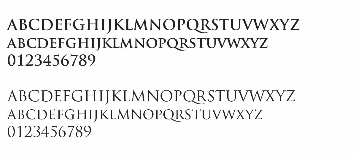
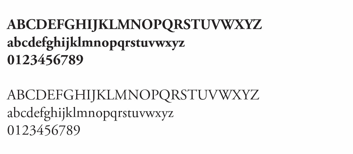
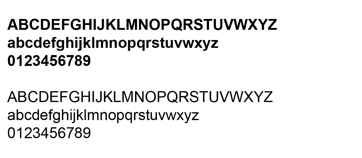
Typography
Fonts used by DNR convey a certain personality and perpetuate our mission to sustain, enhance, protect and conserve Georgia's natural, historic and cultural resources. They reflect what we all truly believe in.
If you'd like these fonts, please contact amanda.hrubesh@dnr.ga.gov.
 |
 |
 |
|
Trajan Pro is for use as a header or statement line. Used in the DNR logo, this font boldly grabs your attention. Acts as a legacy font and is most associated with the brand. Note, this font only offers caps, so it should not be used for body text. |
Garamond: our workhorse. This serif font delivers a clean message when used as copy text. This should be the primary font used for official documents. |
Arial is a clean, sans-serif font that empowers and refines text. Arial brings a modern twist on government design, and works well in one-pagers, brochures and other public materials. |
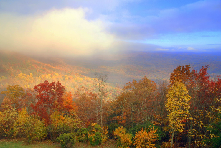
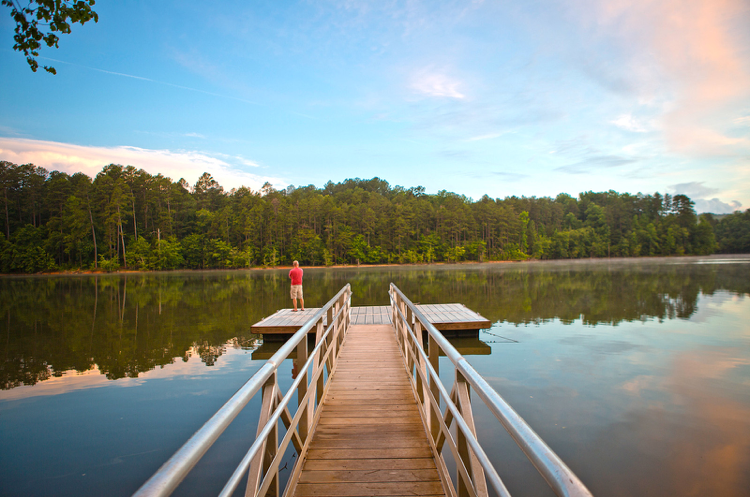
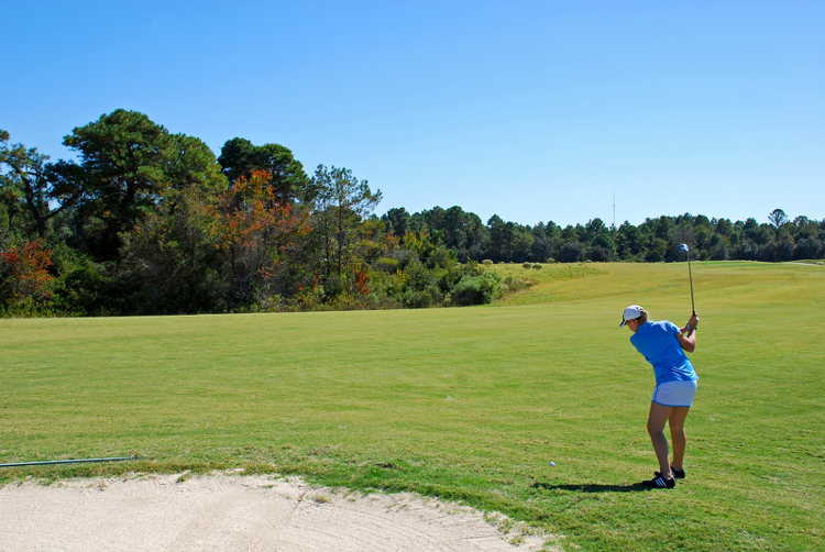
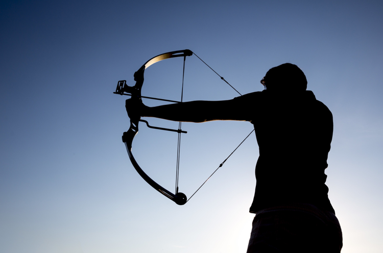
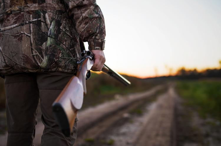
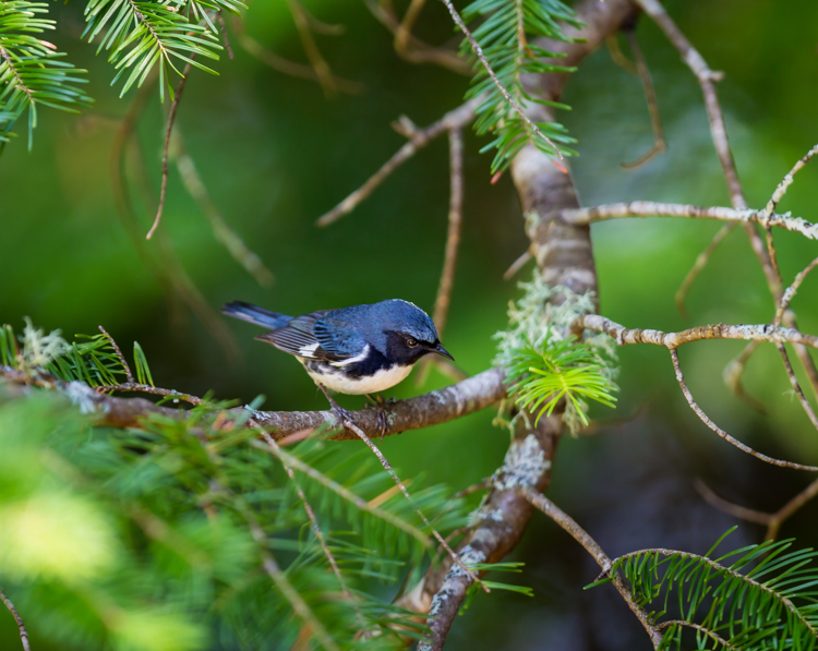
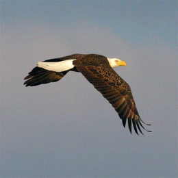
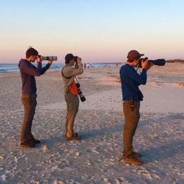
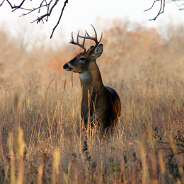
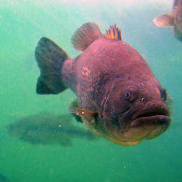
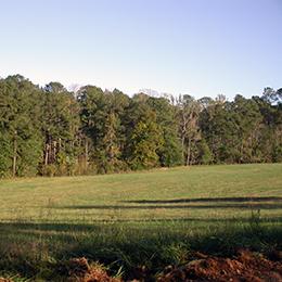
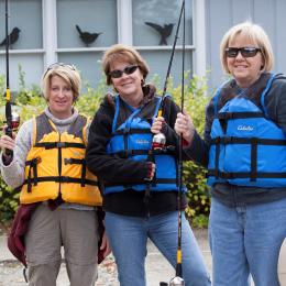
Photography
Photography is an important tool. Best practices include:
- Put the subject in a relevant context and environment.
- Capture moments of real emotion: tenacity, spirit, challenge and achievement.
- Capture action and energy but keep the photo casual in attitude.
- Avoid posing subjects. Let them move around, perform their job and get comfortable.
- Strive for a feeling of vitality.
- Try for a “natural” feeling, as if the subject is unaware of the camera.
- Obtain permission if photographing the general public.
- Most smartphones take excellent photography for general everyday use. It is best practice to turn the phone sideways (longways) to capture the best photo.
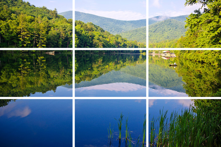
- Use the “rule of thirds” to capture the best parts of a setting: an image should be imagined as divided into nine equal parts by two equally spaced horizontal lines and two equally spaced vertical lines, and that important compositional elements should be placed along these lines or their intersections. Example:
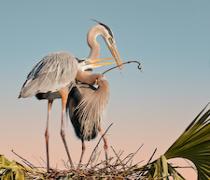
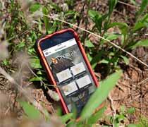
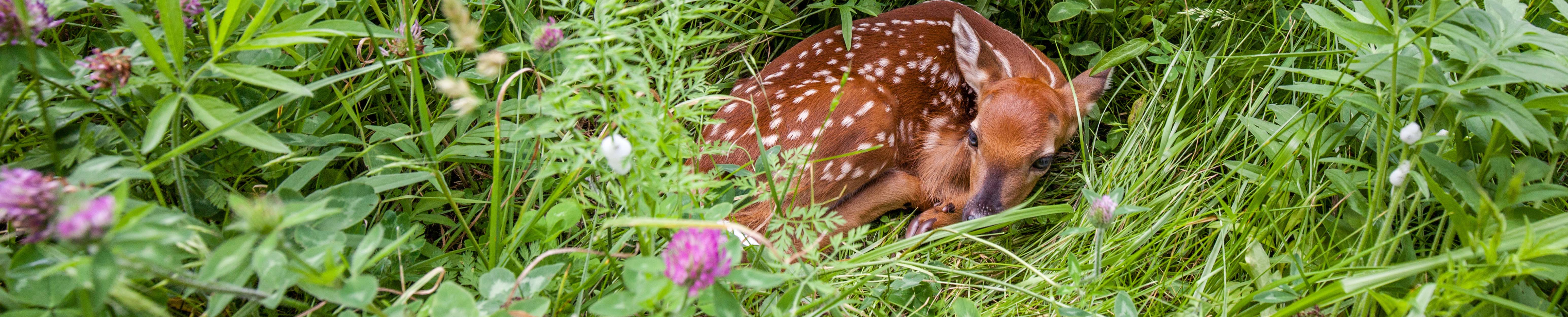
Examples of good photography: